Dress Your Story for the Camera, Not the Closet
What looks amazing in your closet does not always look amazing on camera. Many Calgary creatives and business owners feel surprised when their favourite everyday outfits show up in photos looking flat, harsh, or just not quite like them. The reason is simple: clothing behaves differently in real life than it does through a lens.
Digital and film cameras read colour, print, and texture in very different ways. Throw in Calgary's bright fall light, golden trees, and mix of concrete, glass, and river paths, and your wardrobe choices matter even more. The good news is that with a clear strategy, you can dress for the camera without losing your personal style.
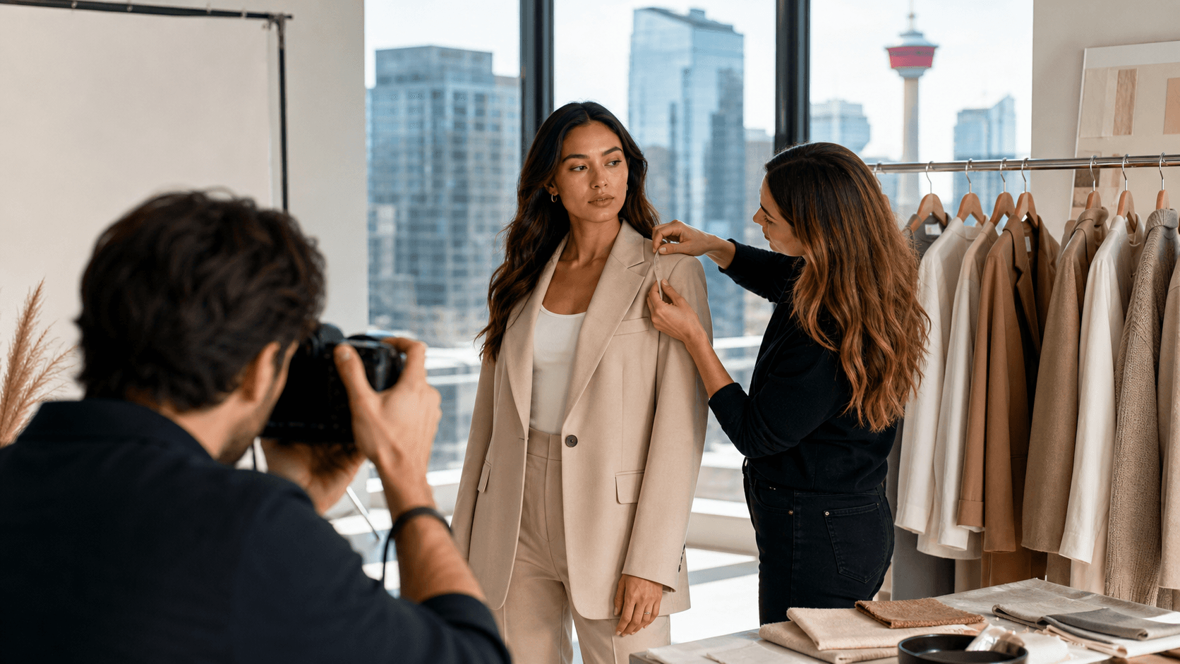
At Isabella Styling, we focus on fashion styling in Calgary that works both in person and on camera. Here we are sharing how to think about colour, print, contrast, and fabric texture for October shoots, whether your photographer shoots digital, film, or a mix of both.
Reading Calgary's Fall Light Like a Stylist
Calgary in October has very specific light. Our high-altitude sun is bright and clear, which can be beautiful but also unforgiving. Midday, the light can wash out pale colours and create sharp contrast. At golden hour, warm tones glow, while cool tones can fade if they are not chosen carefully.
Your location plays a big role too. Think about how these common backdrops behave:
- River pathways and parks: warm leaves, greens, and soft browns
- Downtown core: glass, steel, darker stone, strong lines
- Older neighbourhoods: brick, wood, and softer neutrals
- Home or studio: controlled light, more consistent shadows
For outdoor shoots with fall foliage, colours like rust, mossy green, camel, cream, and deep burgundy tend to sit beautifully against the trees. For urban locations, we like cooler palettes such as navy, charcoal, denim blue, and off-white to balance the concrete and glass without feeling too stark.
A simple way to plan is to choose:
- 2 to 3 main colours that suit your skin tone and shoot mood
- 1 to 2 neutrals (cream, camel, navy, charcoal, soft black) to ground everything
Local styling support helps because someone on the ground can consider the actual locations, the way the light hits at your time of day, and how those details interact with your outfits.
Colour Strategy: Digital Sharpness vs. Film Softness
Digital and film both handle colour in beautiful but different ways. Digital cameras tend to be crisp and punchy. They often boost contrast and saturation, especially in bold hues. This can be wonderful for strong branding images but also means that neon pieces or ultra-bright colours might reflect onto your skin, pull focus from your face, or feel too intense on high-resolution screens.
Film cameras usually give softer transitions and slightly muted tones. Colour feels more romantic and forgiving. On film, mid-tone shades tend to shine, for example:
- Dusty rose or muted blush
- Teal, muted sea blue, or soft sage
- Forest or moss green
- Terracotta or burnt orange
- Oat, mushroom, and charcoal
For October in Calgary, some starting palettes we love are:
Digital-forward shoots:
- Jewel tones like emerald, sapphire, deep plum.
- Clean, soft whites instead of harsh, bright white
- Dark neutrals like charcoal, espresso, deep navy to anchor the look
- Lighter neutrals in layers so your outfit still has dimension
Film-forward shoots:
- Earthy shades like burnt sienna, sage, muted mustard
- Warm taupe, camel, and brown that echo the leaves
- Soft creams and oat instead of bright, cool white
Match your colour story to your message. For personal branding or editorial shoots, bolder colour and higher contrast can help you stand out and look strong. For family, engagement, and lifestyle sessions, softer, blended palettes often feel more timeless and emotional.
Prints That Pop on Camera Without Stealing the Show
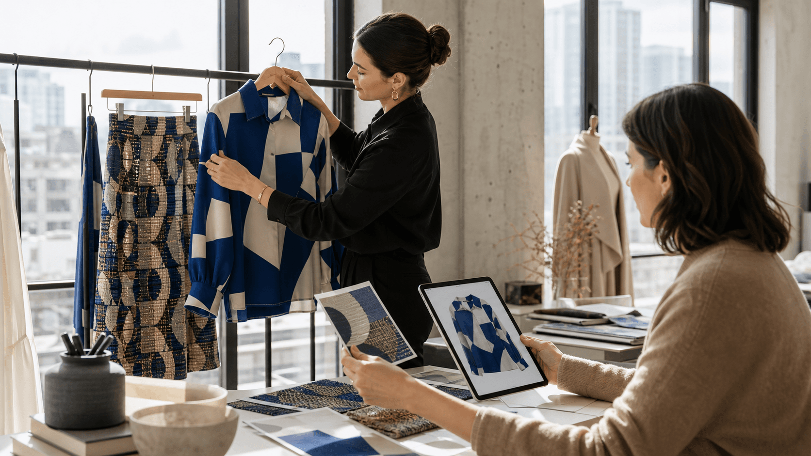
Print is where many outfits go wrong on camera. The main things to think about are scale and spacing. Tiny patterns, such as micro-stripes, small checks, or tiny dots, can cause visual buzzing on digital and can blur together on film. They pull attention in a way that does not feel intentional.
Medium-scale prints usually work best, for example:
- Florals with some space between blooms
- Geometric prints with clear shapes
- Wider stripes that are not too high contrast
- Animal prints with softer edges
Think about your role in the image:
- Lead subject: one statement print is often enough. Pair it with solid pieces so your face still leads.
- Groups and families: choose one "hero" print that sets the palette. Then echo 2 or 3 colours from it in everyone else's solids or subtle textures.
Digital cameras will sharpen the edges of plaid, checks, and graphics. This is great if you want a modern, editorial feel, but it can look busy if there are too many lines. Film softens the edges, which can make dense prints feel mushy. On film, we often reach for simpler, more organic motifs and fewer competing stripes or grids.
In Calgary, many people like a nod to Western style without going full costume. Some easy ways to do that are:
- A classic check shirt in rich, non-neon colours
- A refined bandana print scarf in a soft neutral
- Heritage plaids in coats or blazers instead of full head-to-toe Western wear
The goal is a subtle reference that feels timeless in professional and personal images.
Texture, Contrast, and How Fabric Reads in Motion
Texture may be the quiet hero of camera styling. Different fabrics reflect light in different ways. For example:
- Knit catches shadows in each stitch, which adds cosy depth.
- Silk and satin reflect light, drawing the eye wherever they hit.
- Denim and suiting give structure and clean lines.
- Leather and suede offer soft sheen or matte depth.
Digital cameras pick up fine details very clearly. Ribbed knits, linen slubs, tweed, and heavy weaves will show strongly, especially in close-ups. That can be beautiful for editorial work, but too many strong textures together can look busy.
Film gently softens texture, which flatters skin and flowing fabrics. Very subtle textures may disappear from a distance, so think about how close the camera will be. A chunky knit, brushed wool coat, or suede jacket will still read well on film and add interest.
Managing contrast is also key:
- Against bright Calgary skies and pale concrete, stark black and pure white outfits can make it harder to keep detail in both your clothes and your face.
- For portraits, aim for moderate contrast between your outfit and the background so your features stay in focus.
- Layering with blazers, cardigans, or scarves helps soften sharp lines and gives the eye a gentle transition.
For chilly October shoots, choose fabrics that layer easily over base pieces without clinging.
- Medium-weight knits that drape instead of bulk up
- Brushed wool coats that create a clean silhouette
- Suede or soft leather for depth without stiffness
These textures look beautiful in motion on both digital and film and keep you comfortable while you move, sit, or walk on location.
From Closet to Camera with a Calgary Stylist
Turning all this into real outfits can feel like a lot. That is where working with a personal stylist helps bring clarity and calm. Instead of guessing, we look at your goals, your photographer's style, and your locations, then build a small, focused wardrobe that works hard for you on camera.
A styling session with Isabella Styling typically includes:
- A wardrobe edit to see what already photographs well and what to skip
- A tight shopping list or curated pulls from local Calgary boutiques that match your colour, print, and texture plan
- A simple shoot-day outfit map so you know what to wear where, how to layer for warmth, and which accessories adapt easily between digital and film looks
With a clear camera-ready strategy, your clothes stop being a stress point and become part of the story you are telling. Fashion styling in Calgary is not just about looking stylish in person, it is about making sure your outfits translate beautifully through the lens, in this season's light, and on every screen and print where your images will live.
Refresh Your Wardrobe With Confident, Personalized Style
If you are ready to feel more polished, aligned with your lifestyle and confident in every outfit, our team at Isabella Styling is here to help. Explore how our fashion styling in Calgary can simplify your daily dressing and elevate your look for work, events or everyday life. Share a few details about your goals and schedule, and we will recommend the right service and next steps for you. If you have questions or prefer to speak with us directly, simply contact us.